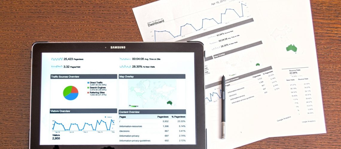
 Many Business Intelligence tools contain reports with beautiful diagrams and charts. Such visualizations can easily be distributed across the company. However, those who blindly trust the reported data are at high risk.
For instance, aggregated values usually do not obviously point to the degree to which they represent the whole population. Although many people instinctively assume the figure refers to 100 % of the population. But aggregated values may also contain wrong or even missing values, such as NULL or zero values. For example, a figure that shall represent the revenue of all stores of a supermarket chain on a certain day may only refer to 70 % of all stores, since the data from 30 % of the stores could not be processed, yet. One would only know about that, if data quality assessment and monitoring reports are in place. The pure revenue figure won’t tell you that.
The Information Quality Institute can help you building an appropriate data quality management system for your company to control and improve your data quality. Please, do not hesitate to contact us! Our experts will be glad to help you.


